Saturday, 31 October 2015

Life Drawing Task 4

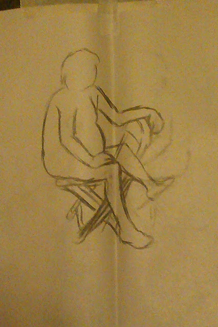
  In this session we had a male model, and we begun again with some practice drawings:
Although my first few were unfinished, I feel that overall I got most of the form and shape right.

Next, the model walked around the room and we were instructed to capture their movement, I found this really difficult as I couldn't read and remember the exact form of the figure, so I attempted at doing "skeletons" to represent what I could remember.


Despite the simplistic lines, I still couldn't capture the feeling of movement, perhaps this is another skill I could work on in the future?

After this, we went back to drawing the model in a stationary pose, but this time we would use 2 mediums: I chose a biro pen, graphite and a yellow marker (which is a little difficult to make out).


Although I enjoyed using the finer mediums, I feel that they resulted being off proportion or mishapen, perhaps it was because I wasn't used to them. The graphite however was a nice size and gave a good line thickness.

Lastly, with a medium of our choice, we would draw the model and move to the next person's canvas, where we would add to their drawing. My choice was the yellow marker.
 What I enjoy about this is how the contrast between yellow and green seems to add to the pencil shading as its own light and dark, which I find to look very impressive.

Monday, 26 October 2015

3D Texturing Test

In this visual design lesson we were introduced to texturing, and editing texture maps, so we turned this lady into a zombie using photoshop and placed it onto a Maya model:


I feel that texture editing isn't too difficult, but being able to line it up with the model is tricky so doing it from scratch would be hard.

Glow Effects: Lava

In this task we practised painting lava digitally as a way of practising glowing entities (such as light trails as seen in sci-fi) by first drawing a yellow shape, then applying orange and red shades over the top of it. We were also taught some things about layers in Photoshop, such as locking transparent pixels and opacity. This is what I made as a result:
We were then taught about layer styles, these are effects that are automatically put onto a layer and can be adjusted. Using a layer style given to us, we went on to take the image below and paint over it to make it into a lava monster. We also cropped it and adjusted the lighting to make it appear more rock like.
Finally, we were given a task to do in our own time, design 3 lava-rock monsters in our sketchbooks and finish our favourite one in Photoshop. The first thing I did was research lava monsters already made:
(http://jedcartwright.blogspot.co.uk/2015/03/lava-monster.html) (24/10/15)
I find that the way the creature is blob-like is very interesting.

 (http://gamerant.com/borderlands-pre-sequel-trailer-screenshots/) (24/10/15)
Perhaps having a canine shaped creature would look good. 

 (http://runescape.wikia.com/wiki/Lava_monster_%28Elder_Kiln%29) (24/10/2015)
Although from an old game, the jaggedness could prove as a design feature.

(http://samuraijack.wikia.com/wiki/The_Lava_Monster) (24/10/15)
Despite being highly stylised and from a cartoon, I like how symmetrical they attempt to be.

After research I then produced 3 sketches:
The first (Top-Left) was created by making something that utilised the shape of an animal, and from there I built around this concept and made the monster have an open ribcage spewing lava, inspired by the gooey monster I researched. This is my faourite design.

The second (Top-Right) one is inspired by the last researched image. For this design I tried to do something more anthropomorphic, however I feel the design is boring and doesn't look like a lava monster.

Lastly the (Bottom-Left) one. While thinking back to my animal based design, I thought it would be cool to make a rideable lava bird. Unfortunately the design of it doesn't seem to be interesting or unique enough to be my final design, despite the good concept.

Of course, this means that my final design is the first one, which I took into photoshop and coloured:
I made this with help of the layer styles, and the glowy lineart was actually a happy mistake. I figured it made the creature look hotter and so I kept it. I'm pleased with how this came out however the use of styles does mean that it is difficult to give the lava any texture, so perhaps next time I could try another method of making the glow work.

Friday, 16 October 2015

Isometric Spriting Task

For this task we were taught the basics of spriting at an isometric angle, and were instructed to create and implement a sprite to go into this image:

This was the sprite I produced:
And this is it implemented into the scene:
I feel that this sprite doesn't match the visual style of the scene, however I do feel that the sprite on its own is successful, and shows my understanding of spriting in 2D.

Tuesday, 13 October 2015

Life Drawing Task 3

As before we drew a live model, one we've drawn previously in fact. And just like my second session our group had to do some poses to warm up:

To make up for last session, I made an effort to be quicker when drawing these, although they seem a bit off I can see this speed helping me to quickly pick up and draw form.


I believe that for these drawings we were shown an example of an expression drawing, and the first two I made were done in a similar style to what I had seen, then we were told to use as few lines as possible and then use our left hand. After this we picked our favourites and least favourites, the first two were my favourite because they had the best and most realistic form, wheras the last two were mishapen and off proportion.
Here we were instructed to use the side of our charcoal, which led to a dark shape on the left, after looking at other people's ideas I produced a "negative" image on the right, which retains some form.
Finally, we had two poses left: one to draw with peaceful music (on the left) and one with loud music (right). I noticed how with peaceful music my drawings have more curves as opposed to the loud music. Overall I can notice my anatomy and reference drawing skills improving.

Monday, 12 October 2015

Sci-Fi Weapon Design Task

For this assignment we have to design a concept for a futuristic gun, and the best place to start is to research real guns for reference and inspiration, as well as to get an idea on what core features they retain when found in science-fiction games, which I'll also research.

First, I looked at shotguns, which all seem to be consistent in shape:
(http://www.coupay.com/topoften/top-ten-shotguns-you-must-have-one-of-them/) (12/10/15)

And then I look at some miniguns, the barrel end is quite simple however the base usually has a frame and a lot of parts:
(https://en.wikipedia.org/wiki/Minigun) (12/10/15)
(http://www.battlefieldvegas.com/collections/mini-gun) (12/10/15)
(https://forums.warframe.com/index.php?/topic/307481-minigun/) (12/10/15)

Lastly, I'll look at sci-fi guns, and present them in a moodboard.


(http://boyluya.blogspot.co.uk/2010/06/fps-weapon-sci-fi-rifle.html) (12/10/15)
(http://digital-art-gallery.com/picture/5341) (12/10/15)
(http://seannash.deviantart.com/art/Sci-fi-Gun-Concept-Art-426445538) (12/10/15)
(http://bflynn22.deviantart.com/art/DS-Prototype-Weapons-319694715) (12/10/15)
(http://www.conceptart.org/forums/showthread.php/267728-SciFi-weapon-design-study) (12/10/15)
(http://www.writeups.org/fiche.php?id=5382) (12/10/15)
(http://es.halo.wikia.com/wiki/Archivo:Halo-Weapons-1600x1200.jpg) (12/10/15)
(https://steamcommunity.com/id/wetaworkshop/myworkshopfiles/?appid=440) (12/10/15)
(https://wiki.teamfortress.com/wiki/Phlogistinator) (12/10/15)
(http://www.nexusmods.com/newvegas/mods/45301/?) (12/10/15)
(http://samplereality.com/gmu/portal/items/show/222) (12/10/15)

Looking at these, it's easy to see that on pure sci-fi themed weapons the angles and curves are highly exaggerated and highly layered in comparison to real life firearms, however they still maintain a similar shape to the real thing and have little details you can probably find on them. I noticed that some sci-fi weapons don't take from real guns at all and give a sort of "alien" theme.


I have produced 3 sketches of gun concepts, first was the pistol (bottom right), which was intended to look toony and simple, but ultimately looked rushed; I attempted to use coils and little gizmos but I couldn't find a way to put them onto the design so as a result it ended up looking a little dull.

Next is the shotgun, where I took my time and tried to create a pure sci-fi themed weapon, for this I used the ruler a lot and started from the barrel to the base, where as it appears my experimentation got more prominent. My critique on this is although it looks like a realistic gun, the design doesn't look the most unique I think it could've been, as well as the fact that the proportions seem off.

Lastly is my minigun, which is my favorite. I started with the base and built outwards accordingly, adding smaller details like a handle and pressure barrel. I found that this was easier to do because it was a larger weapon, so I could include more things. I then quickly converted this into a stylistic final design.


I feel that although simplistic this final design looks unique and interesting, I wish however I could've add some little details to this but I feel it's fine as it is.

Sunday, 11 October 2015

Anatomy: Measuring by Heads

A task we were instructed to do was to practice the 7.5 heads rule, but instead of doing average human proportions we did a dwarf (4 heads) and an elf (9.5 heads). We could look at some references as long as the design was ours.

For this dwarf design I tried making a more modern looking design, and I think I may have messed up the shape a little. I have taken note on how a dwarf's body is quite broad with small legs to make them appear less like children, as well as making their arms big.
This is my elf, where I tried to be unique and point their ears a bit differently. I beleive that this could've looked more in proportion if I had made the chest wider, asides that I'm pleased with both of these drawings.

3D Game Environment Intro: Pre-Production

The following are drafts in regards to creating an intro sequence to a game, 2 of which where created from a template provided to us. Firstly is the One Sheet, it holds the basic fundamentals of your game: The (Working) Title, The X (2 sentence description), the 4 Pillars (What should remain consistent no matter what), the Player's Piece (Protagonist), Mechanics, Story/Goals and more. THis document may see revisions as the project unfolds (except of course the 4 Pillars).
Next we had to create a map of this environment for our opening sequence, using usefull references like concept art from Half-Life. What I've created is a sort of underground station, but uses pressured tubes instead of train tracks, and because my theme is a sort of Art Deco inspired one, I had to keep that in consideration.
Lastly, using the map for help I created a storyboard of this opening sequence, trying to implement the story related events and actions as opposed to noting all the player will do (e.g "walks here", "uses this")
This documentation is crucial for any project, especially game development, as I will use these for reference when I model and program the intro as a greybox. The program we'll be using is Unity and Maya.

Tuesday, 6 October 2015

Battle Arena: Greybox and Overview

For our 3D Art Production we've been tasked to design and build a battle arena using Maya 2016. The first thing I did was research something I thought would make for a good battle arena, and researched images for "castle gardens", inspired from these images I went on to produce a simple greybox of my battle arena, and from this I have created a overview plan on what I aim to produce using example images.


From this I can review details I plan to add, and can help visualize what I hope to produce in the end.

Bibliography:
Images Used:
http://www.odegardletters.com/?p=46 (03/10/15)
http://beachbums1.com/tag/medieval-castle/ (03/10/15)
http://www.clanlindsay.com/new_page_1.htm (03/10/15)
https://bestofnj.com/skylands-castle/skylands-castle-fountain-lawn1 (03/10/15)
http://lesliet.typepad.com/photos/thousand_islands/29_boldt_castle_porch.html (03/10/15)
http://thecuriouscompass.com/tag/angkor/ (03/10/15)

Monday, 5 October 2015

Life Drawing Task 2

In this session we had a male model. Although I was a bit rusty in the first few drawings I quickly got my act together, we were also encouraged to draw with our non dominant hand as well, and also go around and draw on other people's work.

 
As seen above, I did not get enough time to finish my drawings, so speed is something I should also focus on.

In this one above, I used my left hand, and strangely enough I feel it came out looking better.

For this one we had to circle around twice to other people's work, so this is how my work resulted. It appears there's more shape and better form, which I understand is the area I'm working on improving.

Here's the last one for the session, I used both hands for this and I admit in comparison to the prior session these drawings came out a lot better.